Slim Peckins Chocolate Bars Package Design
Role • Self-Appointed Designer & Illustrator
Programs Procreate for iPad, Affinity Suite, Adobe Suite
Tasks package design, layout ideation, color ideation, branding
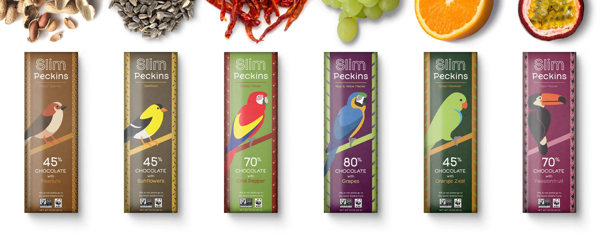
Slim Peckins was an independent exercise borne of the desire to utilize skills and assets from college during the onset of the pandemic. Over the course of development, I revisited and researched each bird subject, which allowed me to better understand the possible connections each bird could have to each other and the product they would ultimately represent. What I found led to exploration of various sizes, layouts, patterns, color ways and word marks to achieve a greater sense of connection between the various elements.
Credits
Vsevolod Abramov • Graphic Designer • created Lena font
This project is slated to be revisited in the near future. Keep your eyes open for updates to this page!
Birds & Chocolate
The field of chocolate bar design hosts an ever-expanding breadth of visual concepts. In the thick of the global pandemic, chocolate bar packaging also lended well to at-home prototyping.
Flavor Cues & Colorways
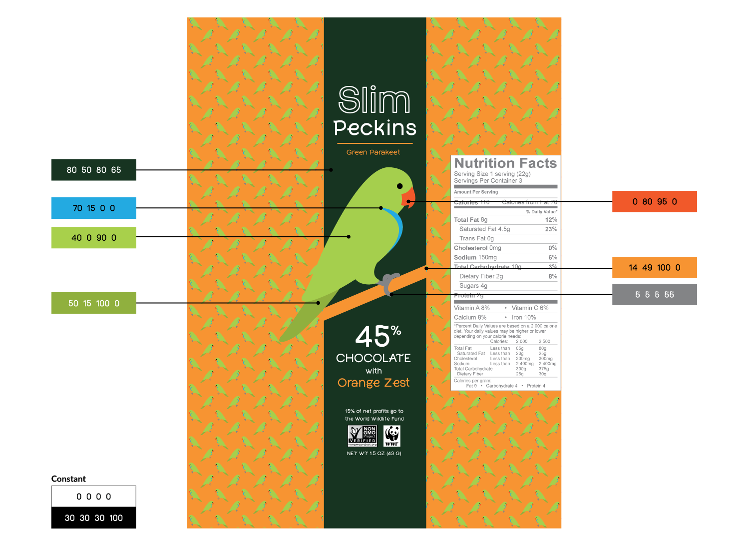
Each bar layout has been developed to have a high contrast for legibility and appeal. The secondary colors chosen to refer to the accent flavor used in each theoretical chocolate bar also function as a contrasting background for each bird and its patterned likeness.
Layout & Proportions
The Slim Peckins series lies within a particular layout for legibility and continuity. The bird may change position depending on their form, but the goal of these bounding boxes is to keep the visual weight in the same place.
Wordmark
Slim Peckins has been set in Lena, a font created by Vsevolod Abramov. It was chosen to reflect the cleanliness of the geometric illustration style as well as the inviting, informal nature of a mid-grade chocolate bar and the graceful energy of the featured birds.


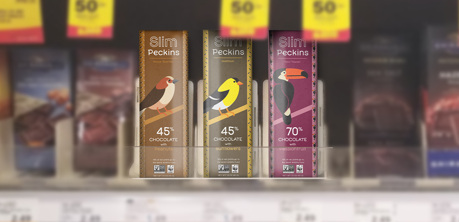
Field Testing
Meijer chocolate section circa February 2020
